AI answer from Opus 5.5 · low effort · 2 Oct 2026
9 of 9
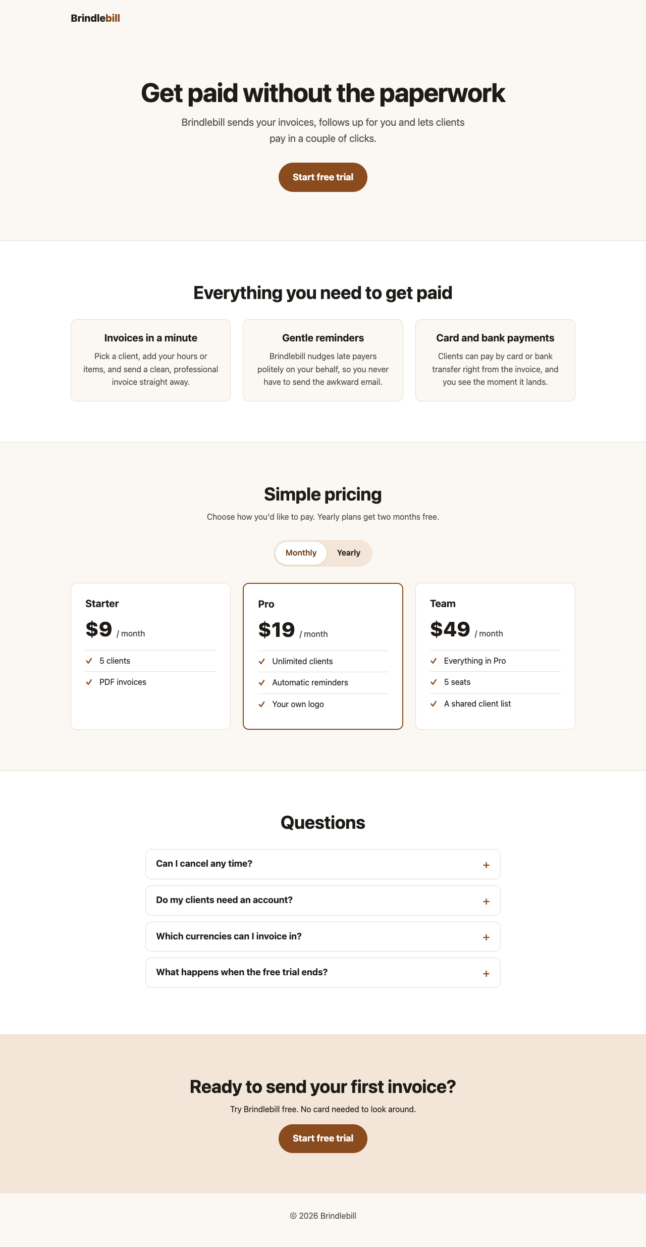

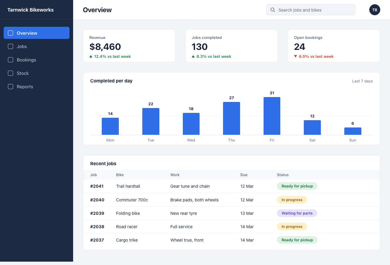
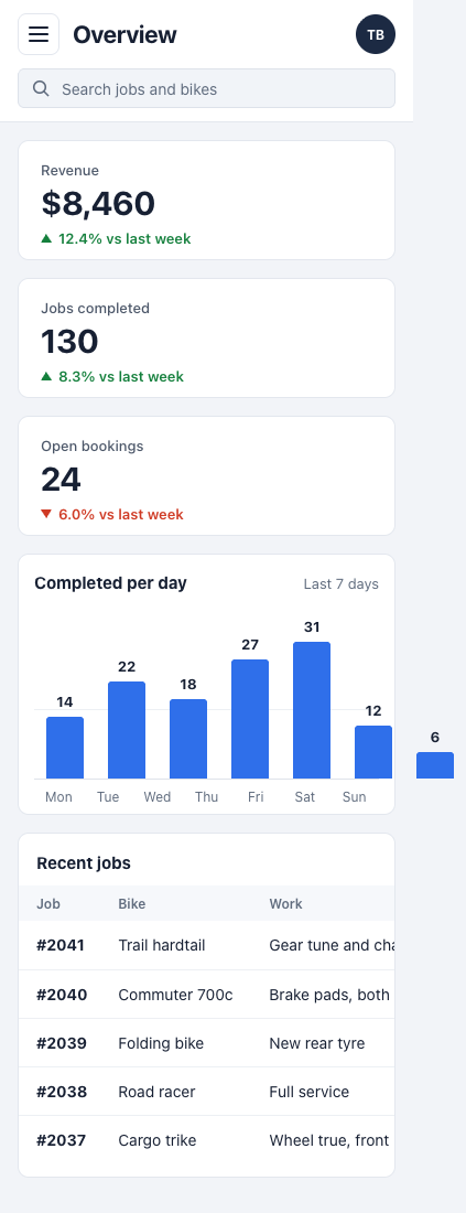
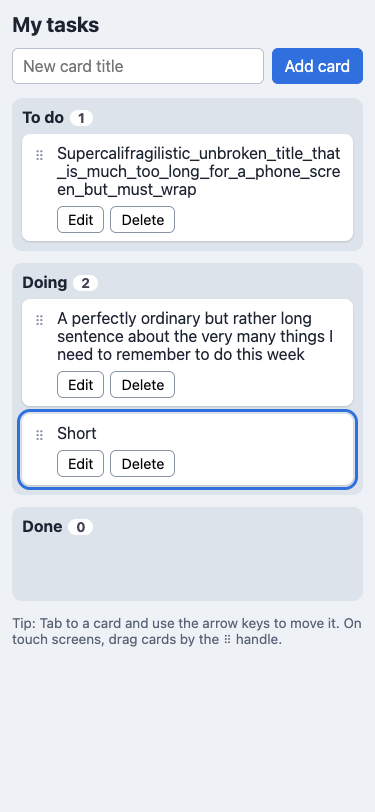
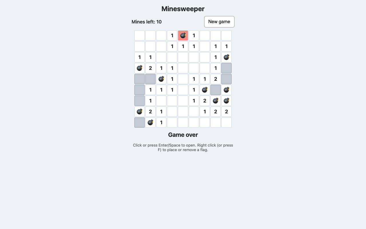
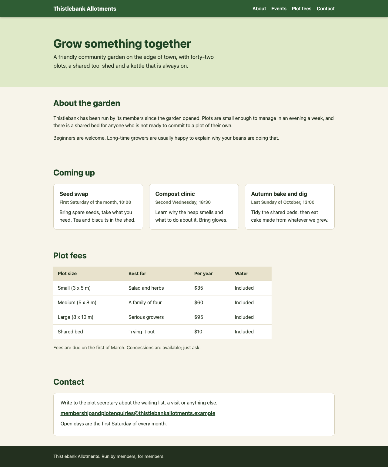
More screenshots (2).
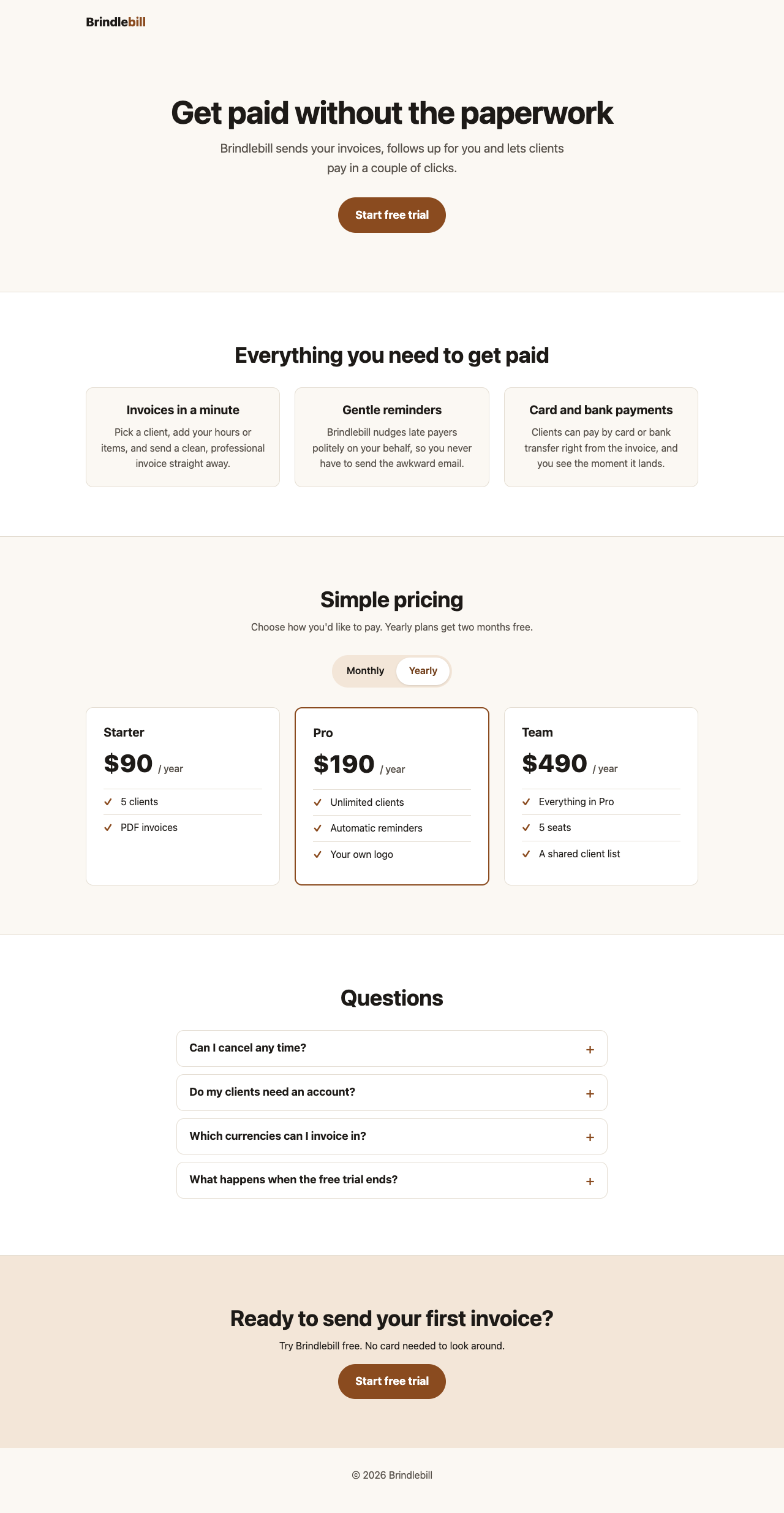

Show the code and the answer.
Here's the complete file. Save it as index.html and open it in a browser.
<!DOCTYPE html>
<html lang="en">
<head>
<meta charset="UTF-8">
<meta name="viewport" content="width=device-width, initial-scale=1">
<title>Brindlebill: Simple invoicing for freelancers</title>
<meta name="description" content="Brindlebill helps freelancers send invoices, chase payments gently and get paid by card or bank.">
<style>
:root {
--ink: #1d1a17;
--muted: #57514a;
--bg: #fbf8f3;
--card: #ffffff;
--line: #e4ddd2;
--brand: #8a4b1f;
--brand-dark: #6e3a15;
--brand-soft: #f3e6d8;
--radius: 12px;
}
*, *::before, *::after { box-sizing: border-box; }
html { -webkit-text-size-adjust: 100%; }
body {
margin: 0;
font-family: system-ui, -apple-system, "Segoe UI", Roboto, Helvetica, Arial, sans-serif;
font-size: 1rem; /* 16px minimum */
line-height: 1.6;
color: var(--ink);
background: var(--bg);
}
.wrap {
width: 100%;
max-width: 1040px;
margin: 0 auto;
padding: 0 1.25rem;
}
.skip-link {
position: absolute;
left: -9999px;
top: 0;
background: var(--ink);
color: #fff;
padding: 0.75rem 1rem;
z-index: 10;
}
.skip-link:focus { left: 0; }
:focus-visible {
outline: 3px solid var(--brand);
outline-offset: 3px;
}
h1, h2, h3 { line-height: 1.2; margin: 0 0 0.75rem; }
h1 { font-size: clamp(2rem, 7vw, 3.25rem); letter-spacing: -0.02em; }
h2 { font-size: clamp(1.6rem, 5vw, 2.25rem); letter-spacing: -0.01em; }
h3 { font-size: 1.25rem; }
p { margin: 0 0 1rem; }
/* Header */
.site-header { padding: 1.25rem 0; }
.logo {
font-weight: 800;
font-size: 1.25rem;
color: var(--ink);
text-decoration: none;
}
.logo span { color: var(--brand); }
/* Buttons */
.btn {
display: inline-block;
font: inherit;
font-size: 1.125rem;
font-weight: 700;
text-decoration: none;
text-align: center;
color: #fff;
background: var(--brand);
border: 0;
border-radius: 999px;
padding: 0.9rem 1.75rem;
min-height: 48px;
cursor: pointer;
transition: background 0.15s ease;
}
.btn:hover { background: var(--brand-dark); }
/* Hero */
.hero { padding: 3rem 0 4rem; text-align: center; }
.hero .pitch {
font-size: 1.25rem;
color: var(--muted);
max-width: 36rem;
margin: 0 auto 2rem;
}
section { padding: 3.5rem 0; }
.section-intro { color: var(--muted); max-width: 38rem; }
.center { text-align: center; }
.center .section-intro { margin-left: auto; margin-right: auto; }
/* Features */
.features { background: var(--card); border-block: 1px solid var(--line); }
.feature-grid {
list-style: none;
margin: 2rem 0 0;
padding: 0;
display: grid;
gap: 1.5rem;
grid-template-columns: 1fr;
}
.feature-grid li {
padding: 1.5rem;
border-radius: var(--radius);
background: var(--bg);
border: 1px solid var(--line);
}
.feature-grid p { margin: 0; color: var(--muted); }
/* Pricing */
.billing-switch {
display: inline-flex;
margin: 1rem 0 2rem;
padding: 4px;
background: var(--brand-soft);
border-radius: 999px;
}
.billing-switch button {
font: inherit;
font-size: 1rem;
font-weight: 600;
color: var(--ink);
background: transparent;
border: 0;
border-radius: 999px;
padding: 0.6rem 1.25rem;
min-height: 44px;
cursor: pointer;
}
.billing-switch button[aria-pressed="true"] {
background: var(--card);
color: var(--brand-dark);
box-shadow: 0 1px 3px rgba(0,0,0,0.12);
}
.save-note { display: block; font-size: 1rem; color: var(--muted); margin-top: -1rem; margin-bottom: 2rem; }
.plans {
display: grid;
gap: 1.5rem;
grid-template-columns: 1fr;
text-align: left;
}
.plan {
display: flex;
flex-direction: column;
background: var(--card);
border: 1px solid var(--line);
border-radius: var(--radius);
padding: 1.75rem;
}
.plan.featured { border: 2px solid var(--brand); }
.price {
font-size: 2.5rem;
font-weight: 800;
margin: 0.25rem 0 1.25rem;
line-height: 1.1;
}
.price .period {
font-size: 1rem;
font-weight: 500;
color: var(--muted);
}
.plan ul {
list-style: none;
padding: 0;
margin: 0;
}
.plan li {
padding: 0.5rem 0 0.5rem 1.75rem;
position: relative;
border-top: 1px solid var(--line);
}
.plan li::before {
content: "✓";
position: absolute;
left: 0;
color: var(--brand);
font-weight: 700;
}
/* FAQ */
.faq-list { max-width: 44rem; margin: 2rem auto 0; }
.faq-list details {
background: var(--card);
border: 1px solid var(--line);
border-radius: var(--radius);
margin-bottom: 0.75rem;
}
.faq-list summary {
list-style: none;
cursor: pointer;
padding: 1rem 3rem 1rem 1.25rem;
position: relative;
min-height: 48px;
}
.faq-list summary::-webkit-details-marker { display: none; }
.faq-list summary h3 {
display: inline;
font-size: 1.125rem;
margin: 0;
}
.faq-list summary::after {
content: "+";
position: absolute;
right: 1.25rem;
top: 50%;
transform: translateY(-50%);
font-size: 1.5rem;
color: var(--brand);
}
.faq-list details[open] summary::after { content: "–"; }
.faq-list details p {
margin: 0;
padding: 0 1.25rem 1.25rem;
color: var(--muted);
}
/* Final CTA */
.cta {
background: var(--brand-soft);
text-align: center;
}
footer {
padding: 2rem 0;
text-align: center;
color: var(--muted);
}
@media (min-width: 720px) {
.feature-grid { grid-template-columns: repeat(3, 1fr); }
.plans { grid-template-columns: repeat(3, 1fr); }
section { padding: 5rem 0; }
.hero { padding: 5rem 0 6rem; }
}
@media (prefers-reduced-motion: reduce) {
* { transition: none !important; }
}
</style>
</head>
<body>
<a class="skip-link" href="#main">Skip to content</a>
<header class="site-header">
<div class="wrap">
<a class="logo" href="#">Brindle<span>bill</span></a>
</div>
</header>
<main id="main">
<section class="hero" aria-labelledby="hero-title">
<div class="wrap">
<h1 id="hero-title">Get paid without the paperwork</h1>
<p class="pitch">Brindlebill sends your invoices, follows up for you and lets clients pay in a couple of clicks.</p>
<a class="btn" href="#signup">Start free trial</a>
</div>
</section>
<section class="features" aria-labelledby="features-title">
<div class="wrap center">
<h2 id="features-title">Everything you need to get paid</h2>
<ul class="feature-grid">
<li>
<h3>Invoices in a minute</h3>
<p>Pick a client, add your hours or items, and send a clean, professional invoice straight away.</p>
</li>
<li>
<h3>Gentle reminders</h3>
<p>Brindlebill nudges late payers politely on your behalf, so you never have to send the awkward email.</p>
</li>
<li>
<h3>Card and bank payments</h3>
<p>Clients can pay by card or bank transfer right from the invoice, and you see the moment it lands.</p>
</li>
</ul>
</div>
</section>
<section id="pricing" aria-labelledby="pricing-title">
<div class="wrap center">
<h2 id="pricing-title">Simple pricing</h2>
<p class="section-intro">Choose how you'd like to pay. Yearly plans get two months free.</p>
<div class="billing-switch" role="group" aria-label="Billing period">
<button type="button" data-period="monthly" aria-pressed="true">Monthly</button>
<button type="button" data-period="yearly" aria-pressed="false">Yearly</button>
</div>
<div class="plans">
<article class="plan" aria-labelledby="plan-starter">
<h3 id="plan-starter">Starter</h3>
<p class="price" aria-live="polite">
<span class="amount" data-monthly="9" data-yearly="90">$9</span>
<span class="period">/ month</span>
</p>
<ul>
<li>5 clients</li>
<li>PDF invoices</li>
</ul>
</article>
<article class="plan featured" aria-labelledby="plan-pro">
<h3 id="plan-pro">Pro</h3>
<p class="price" aria-live="polite">
<span class="amount" data-monthly="19" data-yearly="190">$19</span>
<span class="period">/ month</span>
</p>
<ul>
<li>Unlimited clients</li>
<li>Automatic reminders</li>
<li>Your own logo</li>
</ul>
</article>
<article class="plan" aria-labelledby="plan-team">
<h3 id="plan-team">Team</h3>
<p class="price" aria-live="polite">
<span class="amount" data-monthly="49" data-yearly="490">$49</span>
<span class="period">/ month</span>
</p>
<ul>
<li>Everything in Pro</li>
<li>5 seats</li>
<li>A shared client list</li>
</ul>
</article>
</div>
</div>
</section>
<section class="features" aria-labelledby="faq-title">
<div class="wrap">
<h2 id="faq-title" class="center">Questions</h2>
<div class="faq-list">
<details>
<summary><h3>Can I cancel any time?</h3></summary>
<p>Yes. Cancel from your account page and you won't be charged again. Nothing is locked in.</p>
</details>
<details>
<summary><h3>Do my clients need an account?</h3></summary>
<p>No. They open a link, see the invoice and pay. They never have to sign up.</p>
</details>
<details>
<summary><h3>Which currencies can I invoice in?</h3></summary>
<p>You can invoice in 30 currencies, and each invoice shows the amount in your client's currency.</p>
</details>
<details>
<summary><h3>What happens when the free trial ends?</h3></summary>
<p>You pick a plan. If you don't, your account switches to view-only and your invoices stay safe for 90 days.</p>
</details>
</div>
</div>
</section>
<section class="cta" id="signup" aria-labelledby="signup-title">
<div class="wrap">
<h2 id="signup-title">Ready to send your first invoice?</h2>
<p>Try Brindlebill free. No card needed to look around.</p>
<a class="btn" href="#signup">Start free trial</a>
</div>
</section>
</main>
<footer>
<div class="wrap">
<p>© <span id="year"></span> Brindlebill</p>
</div>
</footer>
<script>
(function () {
var buttons = document.querySelectorAll('.billing-switch button');
var amounts = document.querySelectorAll('.price .amount');
function setPeriod(period) {
buttons.forEach(function (b) {
b.setAttribute('aria-pressed', String(b.dataset.period === period));
});
amounts.forEach(function (el) {
el.textContent = '$' + el.dataset[period];
el.nextElementSibling.textContent = period === 'yearly' ? '/ year' : '/ month';
});
}
buttons.forEach(function (b) {
b.addEventListener('click', function () { setPeriod(b.dataset.period); });
});
document.getElementById('year').textContent = new Date().getFullYear();
})();
</script>
</body>
</html>Notes
- Yearly prices are 10 × the monthly price: Starter $90, Pro $190, Team $490, each shown as "/ year".
- FAQ uses the built-in
<details>/<summary>elements. They open and close without JavaScript and work with a keyboard and screen readers. - Headings: one
h1, anh2for each section, and anh3for each feature, plan and question. - Mobile: all text is at least 16px. Columns stack on narrow screens, and buttons are at least 44px tall so they're easy to tap.
- Sign-up button: both "Start free trial" buttons currently point to
#signup. Change thehrefto your real sign-up URL. The line "No card needed to look around" under the bottom button is a placeholder, so edit it to match how your trial actually works. - I wrote the headline, pitch and feature sentences myself, so change them as you like.
- Floor2/2, 100% passed
- Middle4/4, 100% passed
- Top3/3, 100% passed
9 of 9 checks passedfloor 2/2, middle 4/4, top 3/3
- The page loads with no errors in the console
- Every section is there, with the exact plan names, prices and text
- No sideways scroll on a 375 px phone
- Nothing is loaded from outside the file
- One h1, no skipped heading levels, text 16 px or larger, enough contrast
- The page looks finished: clear hierarchy, pricing easy to compare, nothing broken
- Yearly shows $90, $190 and $490, and Monthly brings back $9, $19, $49
- Each FAQ question opens and closes from the keyboard
- Still no sideways scroll on a phone with Yearly on and every FAQ open
- Took 42 s.
- First words after 4.7 s.
- Wrote 5,389 tokens, 209 of them thinking.
- 11¢ at API prices.
All numbers.
| Time to finish | 42 s |
|---|---|
| Time to first words | 4.7 s |
| Input tokens | 2 |
| Cached tokens | 1,272 |
| Output tokens | 5,389 |
| Thinking tokens | 209 |
| Words in the answer | 1,314 |
| Price at API rates | 11¢ |